PRODUCT DESIGNER

Sara Tejada

I turn complex ideas into clear, thoughtful experiences.

View selected work →
Sara Tejada
BOGOTÁ, COLOMBIA
Product Design Visual Systems Enterprise AI Consumer Apps Design Systems Agency Work UI Design Product Design Visual Systems Enterprise AI Consumer Apps Design Systems Agency Work UX Strategy

Case Studies

SIDE PROJECT

Garten —
Hydroponics for humans

Outside of client work, I'm building Garten — a brand rethinking how people connect with growing food at home. From product and packaging to digital touchpoints, the goal is making growing feel natural, beautiful, and everyday.

Brand identity & visual language
Packaging & physical touchpoints
Digital experience & content
@go.garten ↗
Case Study — 01

Pfizer AMP
Marketing Intelligence
Platform

Role
Visual Designer
Team of 4
Timeline
5 months
In implementation
Client
Pfizer
via Publicis Sapient
Type
Enterprise AI
Internal Platform
EnterpriseAI ProductB2BVisual DesignDesign Systems

An internal marketing platform for Pfizer's global teams — unifying campaign management, brief creation, asset search, and AI assistance into a single intelligent experience.

Pfizer AMP dashboard

One platform for
everything marketing

Pfizer's marketing teams were juggling campaigns, assets, briefs, and approvals across disconnected tools. The goal: unify everything into a single intelligent platform — with AI that felt genuinely useful, not bolted on.

It needed to feel like Pfizer — precise and trustworthy — but modern enough that teams would actually want to open it.

Pfizer Brief

Three directions,
one decision

Three distinct design languages explored — I owned Direction 2 end-to-end.

Direction 1
Direction 01
Essential Platform
Confident · Precise · Neutral
Clean layouts, soft neutrals, precise structure. Reduces visual noise so information hierarchy does the work.
✓ Selected — most on-brand for Pfizer, easiest to scale
Direction 2
Direction 02
Trusted Guide
Friendly · Modular · Approachable
Shapes and layers create warmth. Modular system, familiar patterns, human tone. I led this direction.
Well-received — warmth appreciated but deprioritized for scale
Direction 3
Direction 03
Intelligence Hub
Bold · Energetic · Optimistic
Bold color, high contrast, energetic geometry. Data-forward and vivid.
Too bold for a daily-use enterprise context
"Having three genuinely distinct, well-defended options gave stakeholders a real decision to make — not a rubber stamp."
On the value of the direction process

The AI chat
component

Once Direction 1 was chosen, I focused on the AI chat component and full platform flows — letting users surface tasks, draft briefs, and find assets from one place.

"Good morning Amanda, it's sunny in New York — here's what needs your attention today."

AMP AI Chat

Stakeholders satisfied,
platform in implementation

Five months from exploration to handoff, the platform entered implementation. The AI assistant received particularly strong feedback.

5
Months from kickoff to handoff
3
Design directions explored
In implementation
Next case study
Gizmo — Kids' Smartwatch Companion App
Verizon · Case Study 02

Gizmo —
Kids' Smartwatch
Companion App

Role
UX & UI Designer
Timeline
1.5 Years
Client
Verizon
Recognition
NYT Wirecutter — Best Smartwatch for Kids
ConsumerUX + UIWatch OSMobile AppNYT Wirecutter Recognized

GizmoHub is the companion app for Verizon's Gizmo smartwatch for kids. The redesign aimed to make it friendlier and more intuitive for parents, while making the watch experience genuinely fun and useful for kids.

Gizmo — GizmoHub app and watch overview

More than a
parental dashboard

Gizmo is Verizon's kids' smartwatch. Its companion app, GizmoHub, let parents manage everything — but felt more like a control dashboard than something a family would enjoy.

Navigation was confusing and features felt limited. The redesign aimed to fix that.

Two users,
one product

The core tension in designing for Gizmo is that you have two very different users sharing one product. Getting that balance wrong in either direction kills the product.

Parents
Control without feeling like surveillance software
Parents need control over location, permissions, and restrictions — but it can't feel clinical or alarming. Knowing where your kid is should feel reassuring.
Kids
Something fun and theirs — not a leash with a screen
Kids need to feel like the watch is expressive, age-appropriate, and enjoyable. Too playful and parents don't feel the safety assurance they're paying for.
"Too clinical and parents trust it but kids resent it. Too playful and parents don't feel the safety assurance they're paying for."
The dual-user design constraint

Across both the watch
and the app

I worked across both the GizmoHub phone app and the watch experience, leading UX and UI on several key features.

01
Group Chat
Real-time communication for kids that felt age-appropriate and safe — across both the watch and the parent app.
02
Activity Tracker
Run, walk, bicycle and more. Making physical activity visible and motivating for kids while giving parents a meaningful health snapshot.
03
Voice Assistant
A key feature for younger kids who aren't comfortable typing. Designing the interaction model, states, and feedback so it felt responsive and reliable.
04
Photo Editing
Creative tools for kids on the watch — making photography and editing feel playful without overwhelming a tiny interface.
05
Parental Permissions
The highest-stakes feature from a parent trust perspective. Redesigning restriction flows to feel calm and clear rather than alarming.
06
Map Enhancement
Location needed to communicate safety without anxiety. The map was redesigned to feel reassuring — knowing where your kid is should be a calm moment.
GizmoHub 1 GizmoHub 2

An achievement,
not a report card

The activity tracker needed to feel motivating for kids and informative for parents — rewarding effort without feeling clinical.

From selecting an activity to reviewing a summary, each state felt age-appropriate and rewarding.

Activity tracker

A voice that
feels reliable

A key feature for younger kids — the assistant handles practical tasks like alarms and questions, plus fun ones like rolling dice and telling jokes.

Voice assistant

Even charging
tells a story

As the battery fills, the screen fills with liquid — earth tones at low charge, teal water mid-way, vibrant green at full. A small detail kids notice and enjoy.

Charging animation

Sales up.
Reviews up.
NYT Wirecutter.

Sales and user reviews both increased — feedback from parents and kids reflected the shift in tone the redesign aimed for.

New York Times Wirecutter named Gizmo one of the best smartwatches for kids.

Sales vs. previous version
User reviews — parents & kids
NYT
Wirecutter — Best Smartwatch for Kids
Next case study
Marq — Global Digital Platform
Case Study — 03

Marq
Logistics
Global Digital Platform

Role
UI & Visual Designer
Team of 5
Timeline
3 months
Design complete
Client
Marq Logistics
via Publicis Sapient
Type
Website Redesign
Global Platform
AgencyWeb DesignB2BGlobalDesign Systems

A unified global digital platform for Marq Logistics — consolidating GLP's regional websites into a single, scalable presence serving brokers, tenants, and investors across the US, UK, Brazil, and Japan.

Marq platform

One global brand,
four regions

Marq Logistics needed to consolidate regional websites into a single unified global presence — the premier landlord destination for brokers, tenants, and investors worldwide.

My role: UI and visual design, from direction exploration through to a full component library and all pages.

Designing from
18 stakeholder sessions

Before design began, the team ran 18 stakeholder and customer interviews across the US, UK, Brazil, and Japan. The discovery surfaced a finding that directly shaped the design.

"In most markets, brokers — not tenants — drive the property search process. Landlord websites function primarily as validation tools, not discovery starting points."
Key discovery finding — shaped the entire design approach
Finding 01
Brokers anchor the search experience
In the US, ~90% of property searches are broker-led. The website is accessed late in the journey — to validate, cross-check specs, and access materials.
Finding 02
Fragmented tools create manual work
Brokers stitch together data from internal databases, CoStar, LoopNet, landlord emails, and WhatsApp. The platform needed to fit this workflow.
Finding 03
Regional behavior varies significantly
Japan is ~90% direct-tenant led. Brazil relies heavily on WhatsApp. Europe sees more direct tenant exploration. One design had to serve all four.
Finding 04
Accuracy builds trust
Brokers and tenants need to trust the information on the site before they'll use it. Inconsistent data was the biggest competitor pain point.

Three directions,
one winning bet

The team explored three distinct visual directions before committing to execution.
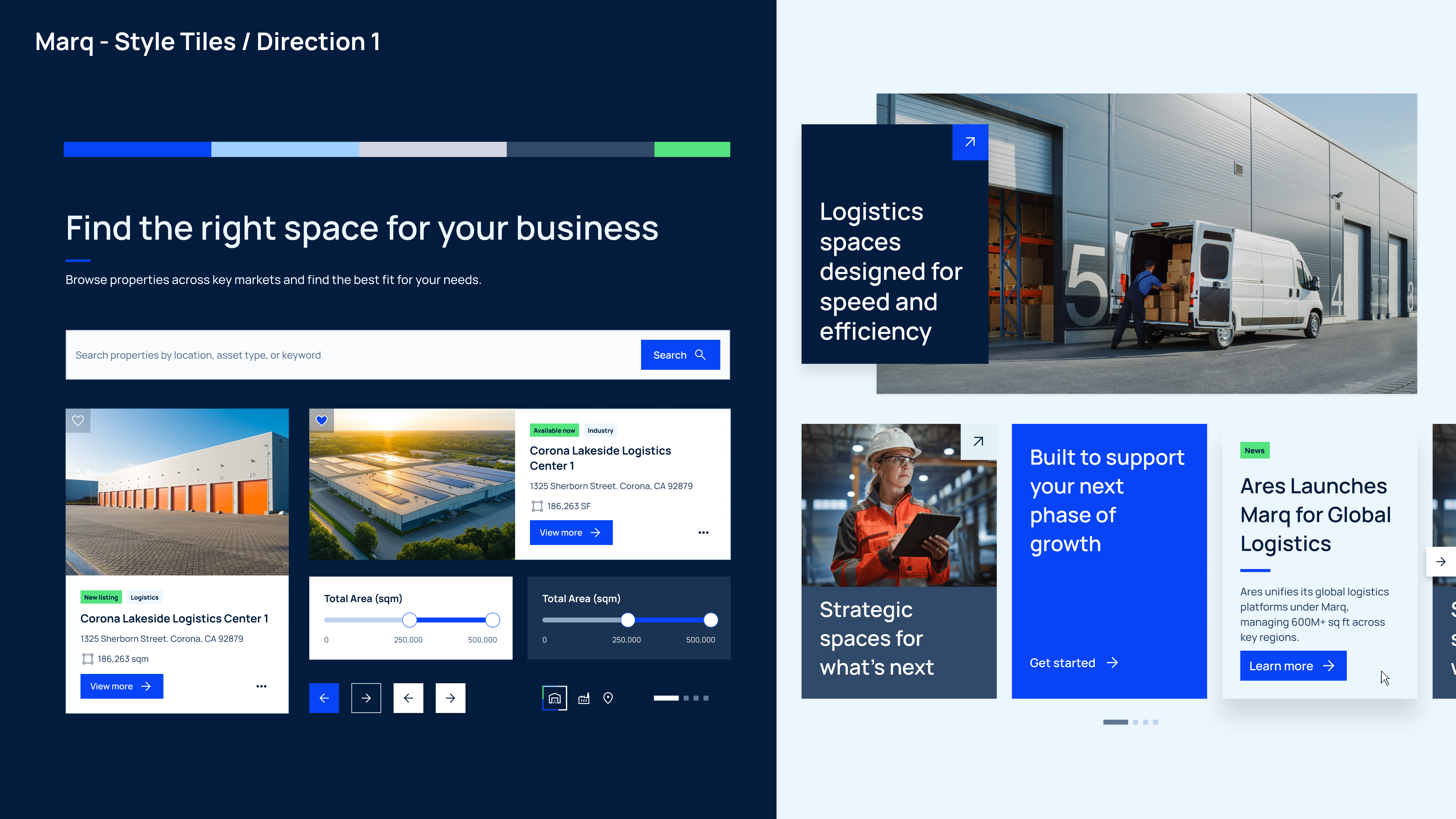
Direction 1
Direction 01
Brand Aligned
Confident · Familiar · Trustworthy
Blue and gray palette, flat corners, geometric shapes, warehouse-specific iconography.
✓ Selected — brand alignment + implementation feasibility won
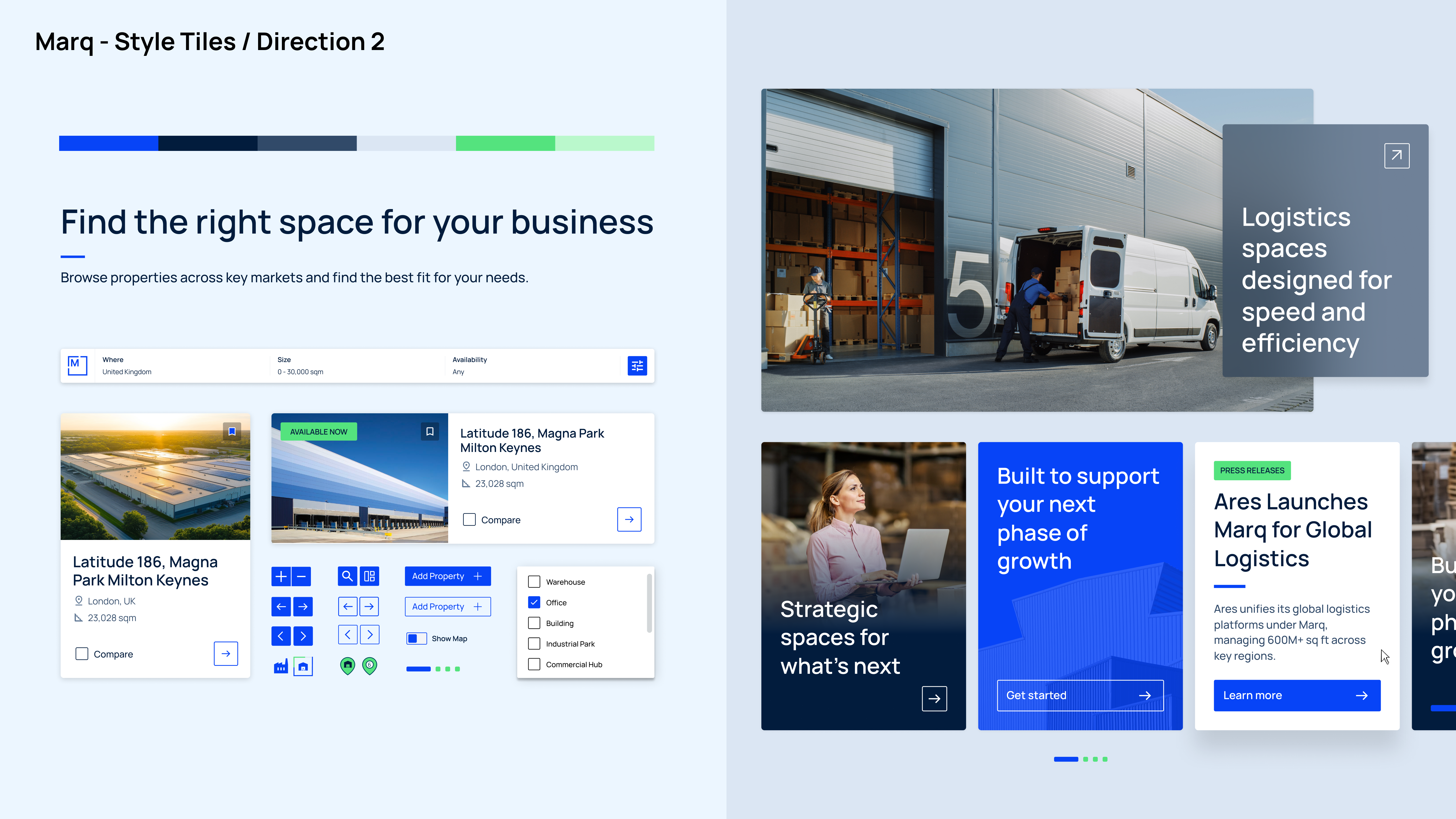
Direction 2
Direction 02
Hybrid Push
Modern · Refined · Approachable
More white space, subtle glass effects, slightly rounded elements, selective use of green.
Elements incorporated selectively into the final direction
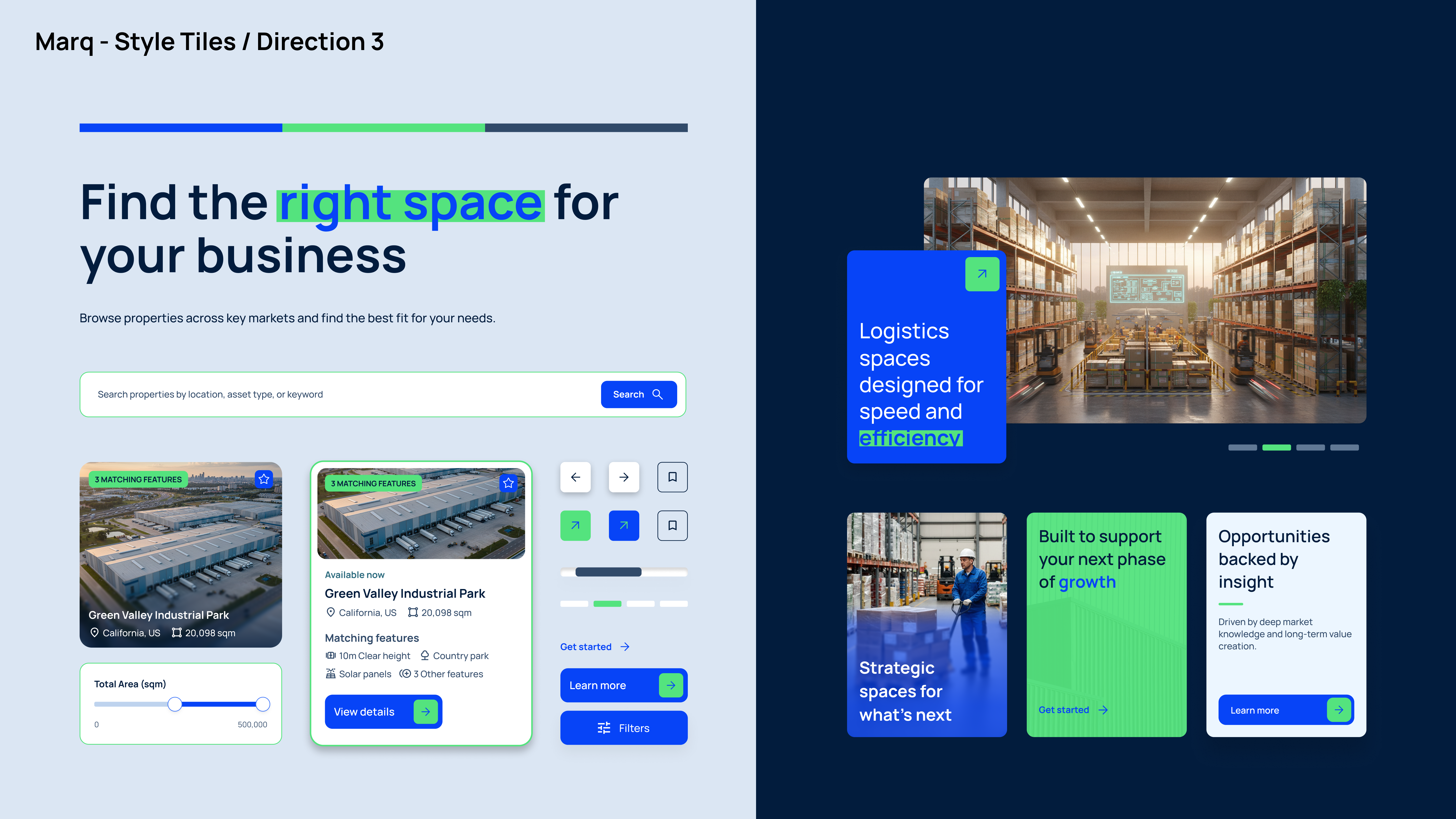
Direction 3
Direction 03
Furthest Shift
Bold · Editorial · Expressive
Full glass-effect tiles, rounded soft corners, full-image cards, color used to highlight text.
Too far from the brand for the client's comfort

Full platform, every page

Once Direction 1 was chosen — with selective details from Directions 2 and 3 — I focused on UI and visual design across the full platform.

Marq platform

Designed for
every screen

Mobile usage among brokers is significant. Every page was designed responsively, with a component library built implementation-ready.

Marq mobile 1 Marq mobile 2

Research to handoff
in three months

Design is complete and entering implementation — a full global digital presence built from research through to component-level handoff in three months.

3
Months from kickoff to complete design
4
Global regions served
Implementation-ready component library
Back to start
Sara Tejada — Portfolio
About me

Designer,
thinker,
plant person.

I'm Sara — a senior product designer turning complex systems into experiences that feel clear and human. 3+ years at Publicis Sapient across enterprise AI, consumer apps, and global platforms.

Curious and creative — I love turning everyday moments into something meaningful, through design, plants, or life in general.

Get in touch →
Sara Tejada
SIDE PROJECT

Garten —
Hydroponics for humans

Outside of client work, I'm building Garten — a brand rethinking how people grow food at home. From product and packaging to digital touchpoints, the goal is making growing feel natural, beautiful, and everyday.

Brand identity & visual language
Packaging & physical touchpoints
Digital experience & content
@go.garten ↗

Let's work
together

Open to senior product designer roles at agencies, tech companies, and consultancies. Building something interesting? I'd love to hear about it.